Back To The Top
Using a little UX know how to make documents nicer for clients and collaborators.
tags: UX
Background
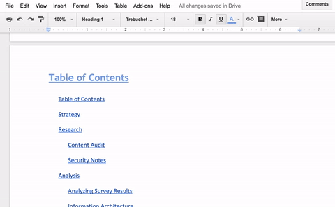
I was reading about Buzzfeed’s product design roles (2.0 !), and I noticed something about their Google doc outlining their product roles: it has document links in the table of contents (really useful!), but if you’re in the middle of the document you have two familiar but slightly unflattering options to get back to the top of the document (that is, back to the table of contents): scroll back up, or slightly faster, drag the scroll bar back to the top. Sure, these methods are usable, but - as most UX designers know — the native solution, while sometimes the right solution, isn’t always the most convenient option. I think about accessibility and great UX as having interfaces that express convenient options, so why not borrow the convenient solution we’ve been using on long, scrolling websites for years: a “Back to the top” button! I remembered I actually implemented this design in a real project report I made at the beginning of this year, in a UX audit report for the national Bonner foundation’s internal documentation system. If you’re curious, here’s how I did it. If you’re not interested in the steps, head to the bottom of this document - I talk about the actual UX of this practice.
How To Add A “← Back To Top” Button In Your Document
Note: This is assuming Google Docs, but you can do this in any document type that supports in-document links.
Step One
Step Two
Step Three
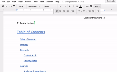
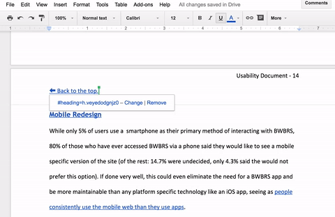
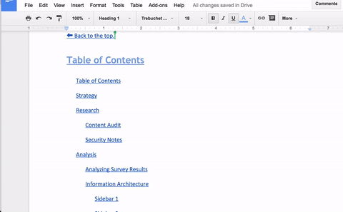
And really, that’s it! It allows you to locate your place within the document pretty easily:
The Actual Usability Of This
So, why did I put it at the top? Well, my intuition tells me that you’re most often scanning a document and reading from the top of any given page when you’re reading, so it’d be easier to realize you’re at the wrong section, or actually need to look at a different section, when at or near the top of the page. I haven’t run any usability studies on this, and haven’t bothered to look into the research because I’m comfortable with using this as an anecdotal design decision as it doesn’t affect actual users, but rather those navigating documentation, who already have a few options to navigate documents. What’s that? You don’t know what other ways there are to navigate a Google Doc? Well, read on! (I promise, if you’ve read this far, you’re almost done!)
One Last Thing - Document Outline
While it’s still a little buggy, I’m really happy that there’s another native option in Google Docs now to add a document outline. It automatically detects its headers, and the detecting and formatting titles, especially those with line breaks, can still bug out the tool, but it’s proving convenient nonetheless, especially for a long document like this:
Note: this doesn’t remove the usability of the “← Back to table of contents.” button. For one, the outline tool may fail/change/not be right for the styling or organization of your document. Likewise, scrolling and the document outline tool aren’t necessarily accessible, and adding a “button” like this in the header doesn’t seem to clutter the actual interface, so why not add the option?
Hope all your documents are a little more usable from now on!
— Andres Cuervo