The UX of Facebook Reaction Statistics
A little redesign to clarify the UX surrounding Facebook's reactions.
tags:
If you’ve been on Facebook recently, you’ll have noticed that below some posts there are more icons than the ubiquitous “Like”. Little faces (or a heart) now populate the statistics for how a Facebook user can interact with content - these are reactions, the first universal evolution of the single-click engagement system on Facebook. I want to take a look at one little design decision today to talk about how a small thing can change the meaning behind a big system like Facebook’s new reactions.
For a silly example, let’s take a look at this post:
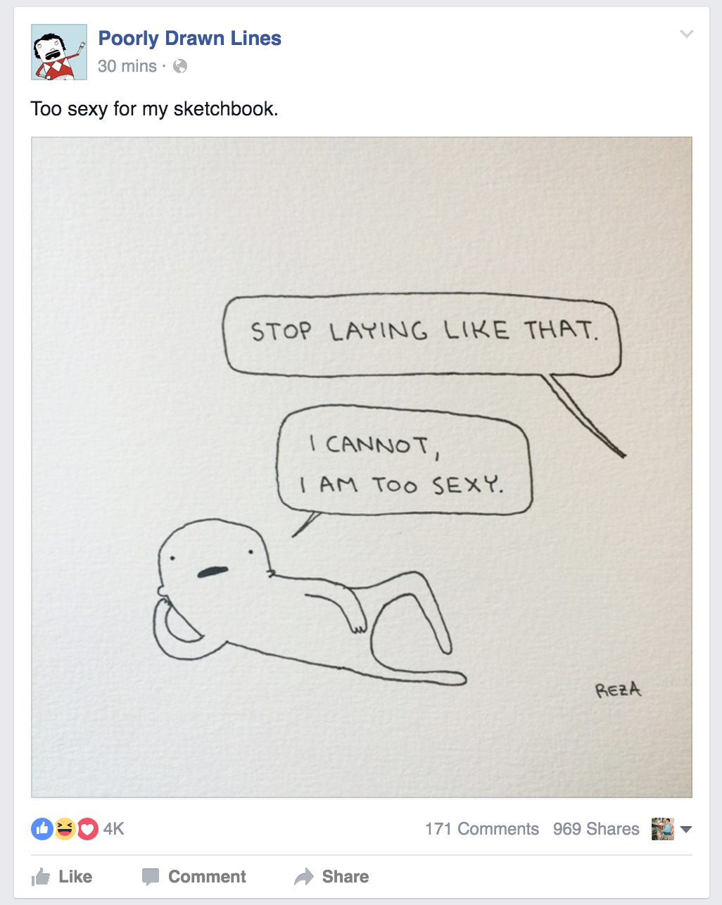
Notice that near the bottom left hand corner Facebook has chosen to indicate the top 3 reactions to a post, followed by how many interactions have been made.
The decision to limit the feedback here to 3 was great; including all 6 reactions and their breakdown would certainly have increased cognitive load for anyone wanting to just take a cursory glance at a post’s engagement. My issue comes with something even more minute: the spacing of the reaction icons.
The problem is in how the negative space (the white space between the actual icons) works. If we take a closer look, we’ll see that the images are cut off just a little bit, it looks like a chunk of about 3 percent of the icons following the leading icon (in our case, the “Like”) is removed, with a slight border of negative space.
Unfortunately, unless - like me - you’re looking at these in close detail, you barely even notice that the icons have been cropped at all. That is, they continue to look like full icons; more over, the danger here becomes seeing this as a list of icons, with the third being attached to that number of engagements following the indicators (in our case, we originally see 4K interactions have been made), making it look like people are overwhelmingly, even homogeneously reacting with a “Love” reaction when this isn’t the case.
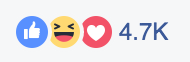
Even if this isn’t the most present danger in interpretation, it’d be nice to guard against and since this has been on my mind I mocked up what a fix would look like, where each icon following the leading one has been sheared roughly in half to make the grouping more obvious:
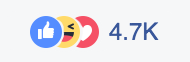
I cut each icon in half and moved them closer, taking advantage of the fact that well designed symmetrical icons are highly mutable and yet still able to display their meaning. Moving everything in like this had the added benefit of allowing me to display an extra decimal point: 4.7K instead of just 4K reactions so that we can get a more accurate sense of the scope of engagement with minimal effort and equivalent screen real estate. Cool, but a UX decision is trivial and dangerous without context, so how does it look if we substitute it in the original image?
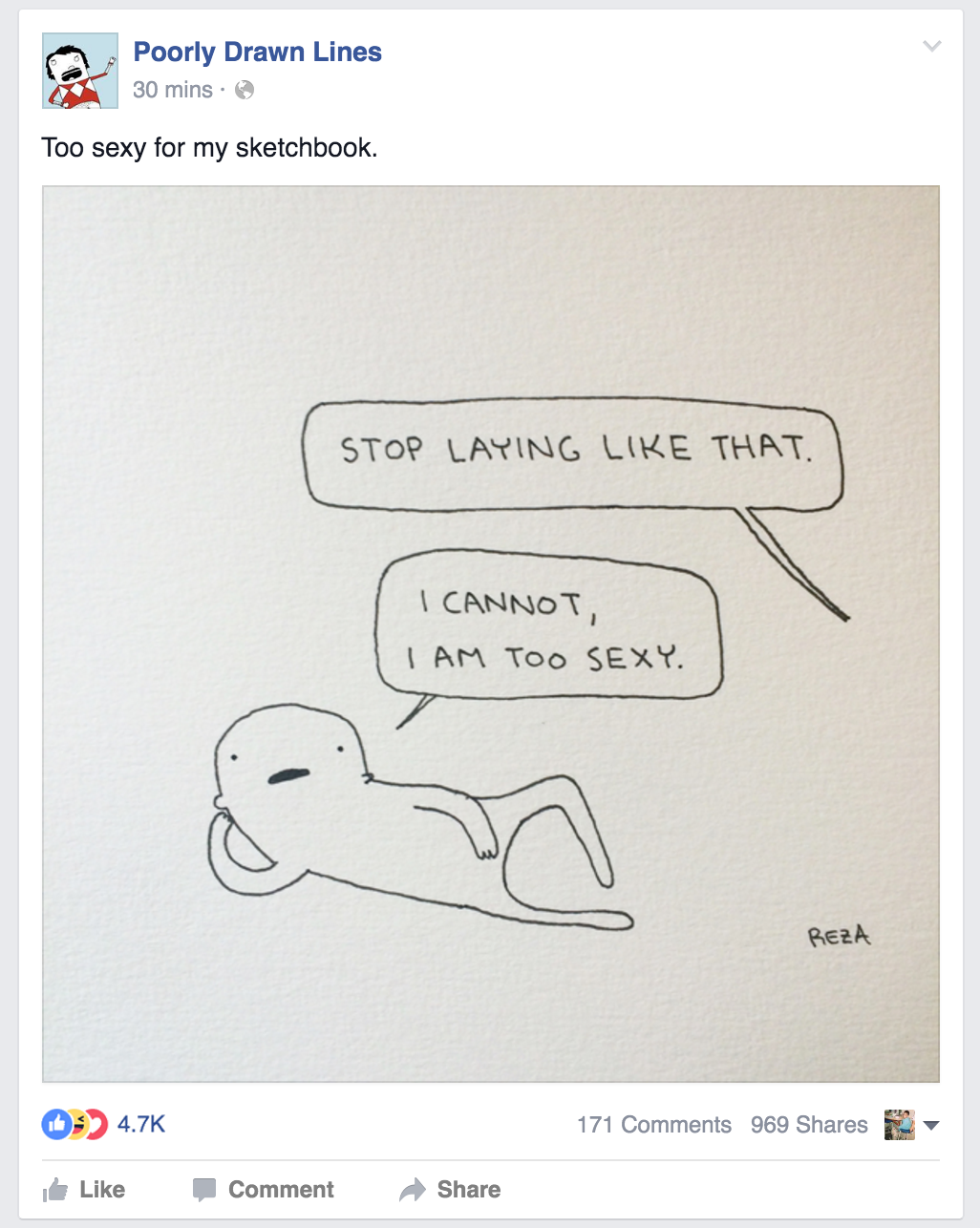
We haven’t lost any information, and my edit seems to make the number attached to the module less ambiguous, removing the danger of anyone thinking 4.7K people “Love”d the post. It’s the small things that matter.
— Andres Cuervo